
To build a KPI dashboard your investors will actually use, focus on clear, relevant metrics that align with your goals. Use simple charts, graphs, and consistent visual styles to highlight key trends and outliers. Keep the design clean, organized, and interactive with filters or drill-down options. Regular updates and automation guarantee data stays fresh and trustworthy. Keep exploring these principles to create a dashboard that truly engages your investors and drives strategic decisions.
Key Takeaways
- Focus on clear, relevant KPIs aligned with investor priorities like growth, profitability, and retention.
- Design with simplicity, using intuitive visuals, color coding, and minimal clutter for quick insights.
- Incorporate interactive elements such as filters and drill-downs to enable exploration of specific data points.
- Automate data updates for real-time or near-real-time accuracy, maintaining trust and engagement.
- Ensure consistent layout and navigation that guides investors naturally to key insights and supports decision-making.
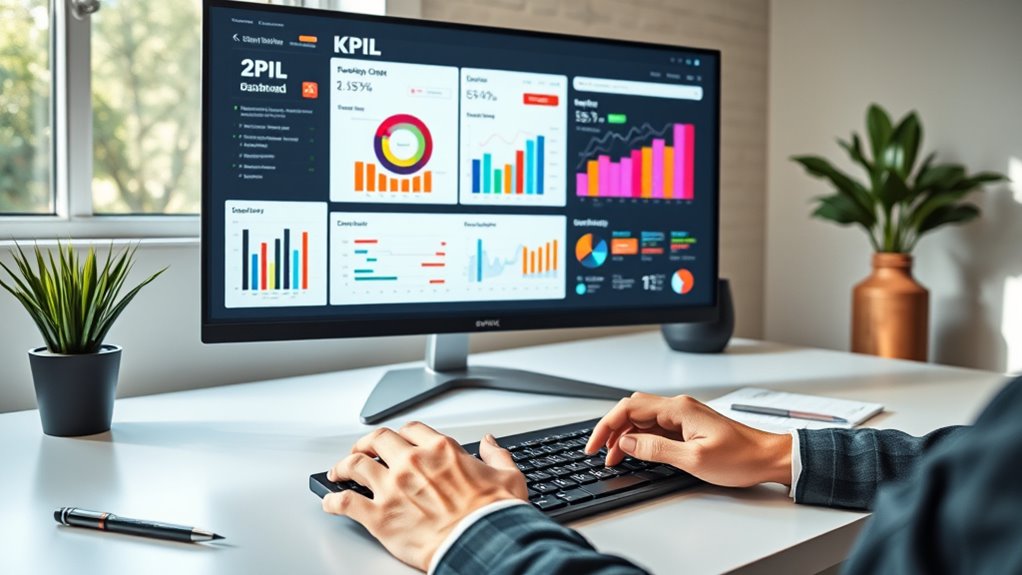
Creating a KPI dashboard is essential for tracking your business’s performance and making informed decisions quickly. When designing a dashboard that your investors will actually use, one of the most important aspects is effective data visualization. You want to present complex data in a way that’s easy to understand at a glance. Use clear charts, graphs, and color coding to highlight key metrics, trends, and outliers. Visual elements should lead the viewer’s eye to the most critical information without overwhelming them with unnecessary details. The goal is to make data intuitive, so investors can quickly grasp how the business is performing and identify areas that need attention.
Effective data visualization simplifies complex metrics for quick, intuitive investor insights.
User engagement is another critical factor. If your dashboard isn’t engaging, investors may ignore it or find it too complicated to interpret. Keep the design clean and organized, avoiding clutter that distracts from the main insights. Incorporate interactive elements like filters or drill-down options that allow users to explore specific data points or time periods. This not only boosts engagement but also empowers investors to customize their view based on what matters most to them. Remember, a dashboard that invites exploration encourages more frequent use, which leads to better-informed decisions.
To maximize user engagement, consider your audience’s preferences and familiarity with data tools. Use straightforward language and avoid jargon that might alienate or confuse users. Consistency in layout and visual style helps users navigate the dashboard effortlessly, making it a natural part of their decision-making process. Additionally, choose the right metrics that align with your investors’ interests. Highlight KPIs that demonstrate growth, profitability, customer retention, or other strategic goals, ensuring these are front and center. When investors see clear, relevant information, they’re more likely to trust the dashboard as a reliable source of insights.
Regularly updating your dashboard ensures it reflects the most current data, which is crucial for maintaining trust and relevance. Incorporate effective data visualization techniques to make information more accessible and engaging. Outdated information diminishes trust and reduces the tool’s usefulness. Automate data feeds where possible, so investors always have access to real-time or near-real-time insights. This continuous flow of fresh data encourages ongoing engagement and helps investors stay aligned with your business’s current performance.

Emeril Lagasse Dual Zone 360 Air Fryer Oven Combo with French Door, 25 QT Extra Large, Cook Two Foods in Different Ways, Up to 60% Faster from Frozen to Finish, Pizza Stone Accessory
ALL-IN-ONE COOKING: This isn't just a toaster oven. It's a french door air fryer toaster oven combo, blending...
As an affiliate, we earn on qualifying purchases.
Frequently Asked Questions
How Often Should I Update My KPI Dashboard?
You should update your KPI dashboard regularly to maintain data visualization accuracy and boost user engagement. How often depends on your business needs—daily or weekly updates work well for fast-paced environments, while monthly might suffice otherwise. Consistent updates keep investors informed and engaged, ensuring they trust your insights. Regular refreshes also help you spot trends early, making your dashboard a crucial tool for strategic decisions.
What Tools Are Best for Creating KPI Dashboards?
When choosing tools for creating KPI dashboards, focus on those offering robust visualization techniques and seamless dashboard integration. Tools like Tableau, Power BI, and Looker excel at turning complex data into clear visuals, making insights easy to grasp. They also integrate smoothly with your existing data sources, ensuring your dashboard remains up-to-date and relevant. Select a platform that aligns with your team’s needs and skill level for the best results.
How Do I Choose the Right KPIS for Investors?
To choose the right KPIs for investors, focus on performance metrics that matter most to their goals, like revenue growth, profit margins, or customer acquisition. Think about what drives investor engagement and aligns with your business strategy. Keep it simple and relevant, avoiding clutter. Regularly review and update these KPIs to reflect changing priorities, ensuring your dashboard clearly communicates your company’s health and growth potential.
Can KPI Dashboards Be Customized for Different Investor Types?
Yes, KPI dashboards can definitely be customized for different investor types. By understanding investor preferences, you can tailor the tools to highlight what matters most, making information more impactful. However, customization challenges may arise, like balancing simplicity with detail or managing multiple views. You’ll want to create clear, concise dashboards that cater to diverse needs while overcoming these hurdles, ensuring each investor feels informed and engaged.
How Do I Ensure Data Accuracy in My Dashboard?
To guarantee data accuracy in your dashboard, you should prioritize data validation to catch inconsistencies early. Regularly perform error detection by cross-checking data sources and automating validation processes where possible. Keep your data updates frequent and monitor for anomalies. This proactive approach helps prevent inaccuracies, builds trust with your investors, and ensures your dashboard provides reliable insights that inform better decision-making.

Greater Goods Coffee Scale with Timer – 0.1g Precision Digital Coffee & Espresso Scale for Pour-Over, Coffee Bean Weighing, Barista Brewing, Waterproof Cover, 3kg Capacity (Onyx Black)
𝗕𝗮𝗿𝗶𝘀𝘁𝗮-𝗟𝗲𝘃𝗲𝗹 𝗣𝗿𝗲𝗰𝗶𝘀𝗶𝗼𝗻: Featuring a 0.1 g sensor with rapid refresh rates, this coffee weight scale responds instantly to...
As an affiliate, we earn on qualifying purchases.
Conclusion
Now that you know how to craft a KPI dashboard your investors will genuinely rely on, remember, it’s not just about data—it’s about making your insights so clear and impactful, they can’t ignore them. A well-designed dashboard can be your secret weapon, transforming complex numbers into a powerful story that drives decisions. Get it right, and you’ll turn your investor meetings into moments of clarity so sharp they’ll cut through any doubt like a hot knife through butter.

SuperCook Pour Over Coffee Kit, Coffee Maker Set, All in One Hand Drip Coffee Set, Coffee Grinder Manual Set, Ideal for Anniversary Birthday Gift
🌟 ALL-IN-1 SET: This set comes with 1pc 32oz gooseneck kettle, 1pc stainless steel coffee filter, 1pc 14oz...
As an affiliate, we earn on qualifying purchases.

SuperCook Pour Over Coffee Dripper Set, Hand Drip Coffee Maker Set, All in One Pour Over Kit with Electric Grinder, Coffee Dripper Set, Ideal for Anniversary Birthday Gift
ALL-IN-1 SET: This set comes with 1pc 32oz gooseneck kettle, 1pc stainless steel coffee filter, 1pc 14oz coffee...
As an affiliate, we earn on qualifying purchases.