

A well-structured B2B landing page matters because it instantly grabs attention, clearly communicates your value, and guides visitors toward your desired action. By focusing on compelling headlines, strong visuals, and a single, persuasive CTA, you make it easy for prospects to understand your offer and trust your brand. Trust signals like testimonials further boost credibility. If you want to learn how to design a page that genuinely converts, stick with us—you’ll discover the key elements here.
Key Takeaways
- A well-structured landing page strategically guides visitors toward desired actions, boosting conversion rates.
- Clear headlines and compelling subheadlines address audience pain points, increasing engagement.
- Prominent, persuasive CTAs clearly communicate next steps, driving user interaction.
- Clean layout, relevant visuals, and focused copy enhance understanding and reduce distractions.
- Trust signals like testimonials and certifications build credibility, encouraging visitor trust and conversions.
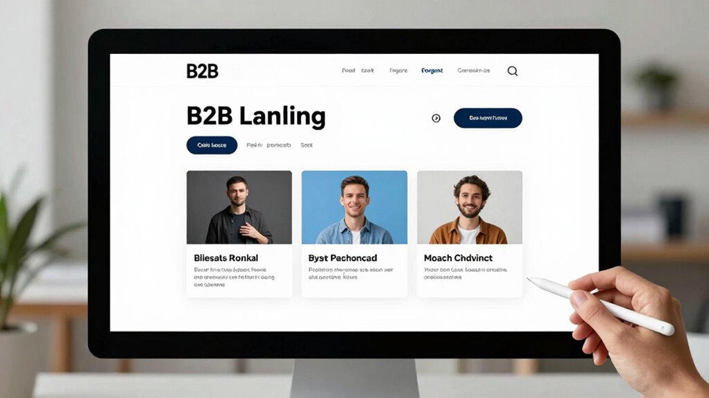
A well-designed B2B landing page is essential for converting visitors into leads and customers. When someone lands on your page, you have mere seconds to grab their attention and convince them to take action. To do this effectively, your landing page should be crafted with a clear understanding of lead generation and user engagement. It’s not just about aesthetics; it’s about strategically guiding your visitors toward a specific goal, whether that’s filling out a form, requesting a demo, or downloading a resource.
Your headline plays a key role in capturing attention right away. It needs to be compelling and relevant, directly addressing your visitor’s pain points or goals. Pair that with a concise, benefit-driven subheadline that reinforces the value you offer. This initial impression helps engage users immediately, increasing the likelihood they’ll stay on your page longer and explore further. Clear, compelling calls-to-action (CTAs) are the backbone of user engagement. Instead of multiple, scattered options, focus on one primary CTA that stands out visually and communicates exactly what you want the visitor to do next. Whether it’s “Get a Free Quote” or “Schedule a Demo,” your CTA should be prominent and persuasive.
The layout of your landing page should be clean and straightforward. Use whitespace strategically to direct attention to key elements like headlines, images, and CTAs. Including relevant visuals or videos can help illustrate your message and foster a connection with your audience. These elements should complement your copy, not overwhelm it. Keep your language focused and benefit-oriented to maintain clarity and momentum. Visitors should immediately understand how your product or service addresses their needs, which boosts user engagement and encourages action.
Trust signals are another essential component. Incorporate testimonials, case studies, or industry certifications to build credibility and reassure potential clients. When visitors see proof that others have benefited from your solutions, they’re more likely to convert. To enhance credibility further, consider integrating content marketing strategies that provide value and establish your authority in the industry. Additionally, understanding the importance of a well-optimized landing page structure can significantly impact conversion rates by making your page more user-friendly and aligned with visitor expectations. Remember, the ultimate goal of your landing page is to facilitate lead generation, so every element should work toward that purpose. Minimize distractions and remove any unnecessary links or clutter that could divert attention away from your main offer.
As an affiliate, we earn on qualifying purchases.
Frequently Asked Questions
How Do I Measure Landing Page Conversion Success Effectively?
To measure your landing page conversion success effectively, focus on key metrics like conversion rate and bounce rate. Conduct A/B testing to compare different versions and identify what resonates best with your audience. Pay attention to user engagement signals, such as time on page and click-throughs, which reveal how visitors interact with your content. Regularly analyzing these metrics helps you optimize your landing page for better results.
What Are Common Mistakes to Avoid in B2B Landing Pages?
You’ll want to avoid the biggest mistake of neglecting your visual hierarchy and weak calls to action. If your page looks cluttered or your CTA isn’t crystal clear, visitors get overwhelmed or confused, and conversions plummet! Make certain your visual hierarchy guides the eye naturally, highlighting your key message and CTA. Don’t make the mistake of underestimating how powerful a well-placed, compelling call to action can be—it’s your conversion secret weapon.
How Often Should I Update My Landing Page Content?
You should update your landing page content at least quarterly to maintain content freshness and stay relevant. Regular updates ensure your messaging reflects the latest offers, industry trends, and customer needs. Along with fresh content, incorporate visual updates like new images or design tweaks to keep your page engaging. This combination enhances user experience, boosts conversions, and signals that your business is active and trustworthy.
Which Design Elements Most Influence B2B Lead Generation?
Powerful, precise placement of your call to action and a clear visual hierarchy greatly influence B2B lead generation. When your CTA is prominently positioned and visually compelling, it quickly captures attention and guides visitors effortlessly toward conversion. Additionally, a well-structured visual hierarchy directs focus, reduces confusion, and enhances user experience. Prioritizing these design elements ensures your landing page effectively engages prospects, increasing the likelihood they’ll take the desired action.
How Can I Personalize Landing Pages for Different B2B Audiences?
You can personalize landing pages for different B2B audiences through audience segmentation and content customization. Start by dividing your audience based on industry, company size, or pain points. Then, tailor your messaging, visuals, and offers to each segment’s specific needs. Use dynamic content tools to display relevant case studies, testimonials, or solutions, ensuring each visitor feels the page speaks directly to their unique challenges and interests.
Conclusion
Think of your B2B landing page as a bridge—carefully built, sturdy, guiding your visitors safely across to become clients. Every element, from headlines to calls-to-action, is a plank that supports their journey. When built with precision and purpose, your page becomes more than just a destination; it transforms into a pathway of trust and opportunity. Invest in its structure, and watch your conversions rise like a well-constructed bridge—strong, reliable, and ready to connect you with success.